
An information design & illustration exercise for a book that breaks down a hymn through storytelling.
ROLE
RESEARCH, CONCEPT, CONTENT DRAFT, DESIGN, ILLUSTRATION, PRINT & PACKAGING
STUDIO
(PROJECT OF) THEREFORE DESIGN & ATAH
RECOGNITION
CII DESIGN EXCELLENCE AWARD 2019
Brief
Many cultural aspects are passed on verbally without understanding the context and sometimes even the exact words and their meaning. The directors of Therefore Design realised about aratis (hymns) such as, Sukhakarta Dukhaharta, commonly sung during the Ganesha festival. The ideas was to design and illustrate a document that explains such verbally passed traditions and direct the audience towards the correct meaning and pronunciations.
Concept
As my graduation project, I joined the directors at Therefore to work on this project and started with research on the content of the hymn. It was then that we realised that even this particular hymn has a lot of historical/ mythological context and information that can be relevant when learning more about it. The vast data available to us meant we could create a book on one hymn instead of a short document.
PROCESS
The first draft of the book took 4 months, during which I researched content, created a storyboard, referenced book formats and explored illustration styles. This cohesive exercise led to a full first draft that defined the basic grid, typography and illustration styles. For illustrations, I studied art books and also visited the site where the hymn was said to be written. Constant user feedback and speaking to experts on book formats, printing and the content itself, was a part of each draft.
Disclaimer
Although the content of this project has a religious context, the aim of the book was to create a document of cultural relevance. For me, it was a great learning of various design processes, working with multiple stakeholders and iterative changes required in design work.


Research & Insights
Research on the hymn's cultural and historical context led me to different stories from mythology that are connected to some of the verses used in the hymn. The temple where the hymn is said to be written was located near Pune and I visited it for research and visual referencing that could be used for the book. Here, I documented ancient engravings that later were used as motifs in the book.
I did a separate visual research on form factors of the book, the typography used, the colours used, which led me to Indian graphic design from the 1900s. Hence, certain decisions made in the book resemble very unique insights found during this research phase. The motifs in the book come from the temple where the arati was written. Few section–defining illustrations come from actual figures like the tortoise found at the temple.
The book has a top spine which is inspired by other cultural artefacts of this kind. The illustrations and colours used are an attempt to call back the styles found in Amar Chitra Katha or Satyajit Ray's design work. The book has a storytelling style where we added stories for more context for ease in reading the book. We even left easter eggs, such as putting Lokmanya Tilak (the freedom fighter who started the celebration of the public Ganesha festival in Pune) in an illustration of a Ganesha procession.


Structure of the Book
The arati is explained in the book in 3 different ways. One is the Marathi verse itself, then is the transliteration of this verse in English for non-Marathi speakers and the last one is the meaning of a verse or a translation to understand the verse. It goes on further where every page with verses has a glossary at the foot of the page with the translation of individual Marathi words in that verse. The book starts with a spread that helps the reader understand the way to go about the book and the structure of the sections.
Stakeholders Involved
Along with the four design directors of Therefore, we consulted an Indologist for fact-checking, a marketing specialist to understand how to involve additional elements to reach our target audience, and a few senior design directors who collaborated with Therefore. The book was written by Chaitra Patel, a team member at Therefore. The initial process hence involved the transfer of information to the content writer and constant discussions with various stakeholders to reformat the book for a better user experience.
Once the book and font sizes, typography and colour were fixed, I was involved in many rounds of testing paper, effects and formats for the sleeve of the book. This required coordination with major printing houses and paper vendors.


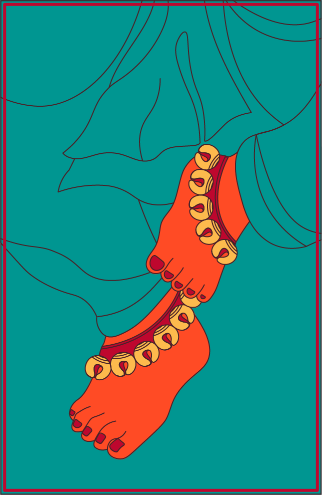
Illustrations
I explored a slightly edgy colour palette that was similar to old Indian comic book colours—deep, saturated colours that almost seemed to be made from natural elements. Since the book was meant to be more artistic than realistic, we went ahead with this choice of colours after testing a few other combinations. Various illustrations were developed in detail based on the verses of the book. The content of the illustrations was broad and included various narratives, stories and traditions that are performed usually. I illustrated portraits of characters, actions, rituals and motifs to better explain the content of the hymn.


